


Customisation of caption characteristics
Section 7.1.4 of EN 301 549 states:
Where ICT displays captions, it shall provide a way for the user to adapt the displayed characteristics of captions to their individual requirements, except where the captions are displayed as unmodifiable characters.
NOTE 1: Defining the background and foreground colour of captions, font type, size opacity of the background box of captions, and the contour or border of the fonts can contribute to meeting this requirement.
NOTE 2: Captions that are bitmap images are examples of unmodifiable characters.
This section requires that tools that display captions allow users to customize the display of those captions, but is not specific about what is sufficient. Note 1 suggests ways they may be customized, but does not specify whether some or all of those characteristics must be customizable, and does not specify the ranges of reasonable values. This explainer provides details about caption display characteristics and recommends approaches to meeting this requirement derived from industry practices.
Unmodifiable characters
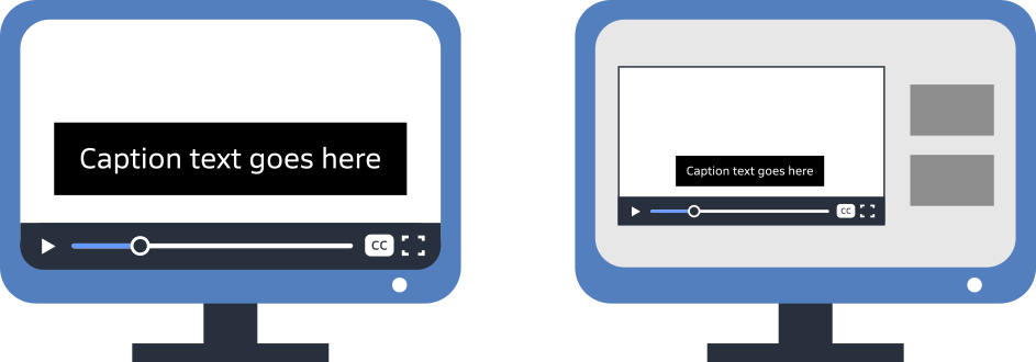
Captions in European television broadcasts are often sent as bitmap images, rather than characters that can be rendered by a text processor. Note 2 clarifies that these bitmap images are "unmodifiable characters”, which cannot be usefully adjusted and are not subject to these customisation requirements. If your captions are distributed solely in these formats, then the content is excepted from this requirement.
On the web and increasingly in digital broadcasts, captions are sent in a format that provides computer-readable text of the captions, with timing and sometimes formatting information. Content using a timed text format to deliver captions is subject to this requirement. We recommend using timed text instead of bitmaps for captions on all platforms that support it, as this supports multiple accessibility enhancements.
Who is responsible
Ultimately, content producers have the responsibility to distribute their content on platforms that meet the requirements . In the European Accessibility Act, the requirement to support customization of captions is in Annex I, Section IV “Additional accessibility requirements related to specific services”. The requirement applies to audiovisual media services as defined in the Audiovisual Media Services Directive . This includes television broadcasts, on-demand television and streaming media, and audiovisual commercial communication such as advertising.
However, in EN 301 549 the requirement is applied to “ICT” used as a general term that is inclusive of hardware, software, and digital content. Any ICT device claiming conformance to the standard would have to meet this requirement, which includes display hardware (including televisions), platform and application software, and content.
ETSI TR 104 060 “Guidance on how to apply the EN 301 549 to digital television products” provides interpretation specifically for televisions. Guidance relevant to this requirement:
- Normally, features of televisions are considered closed functionality, which means the television platform is responsible for meeting the closed functionality requirements in EN 301 549;
- Television manufacturers are responsible for the conformance of the device interface and for pre-installed apps (even when provided by external vendors);
- App developers are responsible for the conformance of apps installed after setup of the television, or running from an external connected device;
- Television manufacturers are encouraged to provide features to allow apps to implement accessibility in an easy and consistent manner, but details are undefined.
Televisions sold in the European market therefore must provide conforming pre-installed apps, but are not responsible for conformance of other apps. Media organisations providing their own television apps for content distribution must ensure those apps meet the requirements. Media organisations distributing their content on third-party television apps must choose apps that meet the requirements.
Apps for display of media content on the web or on mobile phones are also subject to these requirements, although some of the technical issues of implementation are different than for televisions. Like televisions, platforms may provide features to support it, but the final responsibility is with the app developer. Media organisations distributing their content on web or mobile phone apps must choose apps that meet the requirements.
The European Accessibility Act only applies to content and ICT distributed in Europe. Media devices and apps intended for non-European customers might not meet the requirements, yet organisations might use them for broader reach. This should not introduce a conformance concern for the content provider, as long as the content in the European market is distributed in conforming apps. It is important that the content must be available on the same terms in conforming apps as it is in non-conforming apps, so users are not driven, for example, to choose a free inaccessible alternative over a paid conforming version. We recommend that content provided in non-conforming apps include a pointer to a conforming version.

Implementation guidance
Unlike some accessibility requirements that provide specific values to define conformance, there is no single standard for how captions should be displayed, and how that display is customised. Manufacturers determine settings for their products, sometimes following guidance in style guides produced by Deaf advocacy organisations. Some media organisations produce their own style guides as well, which may complement established practices with house style. Style guides address many aspects of caption display, including font, colour, size, position on screen, display timing, overlapping speech, etc.
Many style guides exist, addressing differentiation regional and broadcaster styles. While there is some variability among style guides about how captions should be authored, they are fairly consistent about the characteristics related to this requirement. The recommendations below reflect generally established practices found in these style guides.
Display of captions prioritises rapid and easy readability, which is more complex than standalone text because users view them along with the video itself. The following display characteristics impact readability:
- Text size,
- Typeface,
- Background colour,
- Text colour
- Text outline or shadow.
Although EN 301 549 7.1.4 sets requirements for customization of these characteristics, customization must be considered in context of default values. Default presentation should be easily legible to the majority of users, with limited customisation enhancing this for others. Unlimited customisation of caption display is not desirable, as only a few characteristics predictably enhance readability without introducing problems such as poor contrast, unpredicted layout, or excess occluding of the video. This explainer recommends both default values and customisation features for the above characteristics.
Text size

Recommendation: Set default size of captions to 2 to 2.5 times the size of body text on the device, or a size that will fit 12 to 15 lines on a landscape video. Allow users to enlarge captions to twice that size, and optionally provide one or two additional sizes users can select.
Size of captions balances readability with the amount of the video that is occluded, so they need to be not too small nor too large. Because captions are displayed on devices with a wide range of sizes and viewing distances, these terms are difficult to explain using absolute measures of text size.
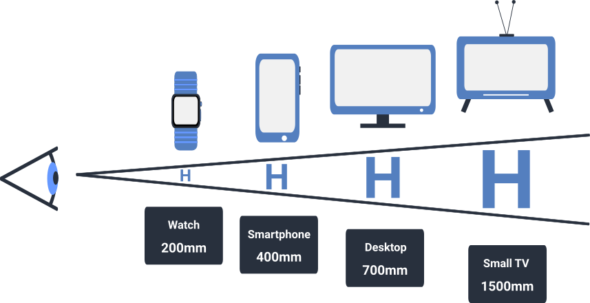
The concept of viewing angle, summarized in the Visual Characteristics section of our EAA explainer (opens in a new tab) with expansion in the article Using cap height and distance to calculate font size (opens in a new tab), provides a more general measure although is more complicated to understand. The proportion of the field of view taken up by an object is the viewing angle. This is demonstrated in the following image, showing how the letter H seen from distances must be rendered at different sizes to occupy a constant viewing angle.
For a non-visual alternative, please see the table below.
As a reference, the height of a line of 10-point text on a standard desktop computer display occupies a viewing angle of approximately 0.2°. If displayed on a phone viewed from closer up, the text can have a smaller absolute size to achieve the same 0.2° viewing angle (and level of readability).
Captions are displayed in a context of more visual distraction than body text, and need to be quickly and easily read. It is common for captions to display at 2 to 2.5 times the size of body text on the device. This corresponds to a viewing angle of 0.4° to 0.5°, or 20 to 25 points on a desktop display. On a 16:9 display, this size means 12 to 15 lines of text would fit in the video (although never more than 3 at a time are used). This is a measure used by some style guides.
The viewing angle can be converted to a font size for a given device. Approximate font sizes for a viewing angle of 0.5° on representative devices:
| Device | Viewing Distance | Font Size |
|---|---|---|
| Watch | 200 | 8 pt |
| Phone | 400 mm | 15 pt |
| Tablet | 500 mm | 18 pt |
| Desktop display | 700 mm | 25 pt |
| Small television | 1500 mm | 55 pt |
| Large television | 2500 mm | 90 pt |
Guidance on resizing of caption text can be taken by examining other EN 301 549 resizing requirements.
- Sections 9.1.4.4, 10.1.4.4 and 11.1.4.4 require that for web, documents, and software content, it must be possible to resize text to at least twice its default size. Although these sections explicitly exempt captions and do not formally apply to other forms of ICT, it is useful to consider that range for meeting the requirement in 7.1.4.
- If the ability to resize captions is provided by the video player, and not via an underlying operating system feature, the implementation counts as closed functionality .In this case, Section 5.1.4. requires that it be possible to scale line height up to a viewing angle of 1° . When functionality is “closed” this requirement applies to all text including caption display.
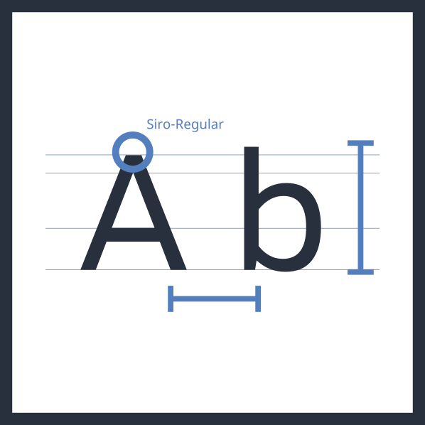
Note : The specific viewing angle requirement is that text can be scaled so the height of a capital letter H occupies a viewing angle of 0.7°. For normal fonts with a cap height of .7, this means the height of the entire line including ascenders and descenders occupies a viewing angle of 1° . This article uses this adjustment because the full line height is used for the background colour, which is part of the readability calculus.
These two measures come together neatly when using the default size for captions recommended above. The closed functional requirement of supporting scaling line height up to a visual angle of1°is the same as doubling the 0.5°default size recommended for web, documents, and software. We recommend supporting text scaling up to a view angle for the line of 1° , which as a rule of thumb should be double the default size.
The implementation of default size and scaling ranges impact how captions are drawn on the screen. For documents, section 10.5 requires that captions not obscure important video information , and we recommend applying that to all media with captions. Caption authors need to design for scaling when positioning captions on screen. But beyond a certain point, further enlargement unavoidably obscures too much of the video. Most systems seem to offer a maximum size similar to this recommendation, and users who need caption text larger than that would route it to a separate window.
Typeface
Recommendation: Choose a good sans serif default typeface, often the platform default sans serif typeface. Some platforms may allow users to customize typeface, but using a broadly readable default typeface is more important.
Captions should be presented in an easy-to-read typeface. Style guides generally recommend a proportionally-spaced sans-serif font with even stroke weight and reasonably open letter forms. The platform default sans-serif font is a common choice. Fonts explicitly designed for easy on-screen reading are sometimes also used. While monospaced fonts are still in use on some platforms, they were used in the past because of the limitations of older technologies, and are not preferred today because they are harder to read quickly than proportional fonts.
Fonts marketed for readability to specific audiences are polarizing, with some users greatly appreciating them but others disliking them. The default typeface for captions should be designed for the majority of users, so such fonts are not good default fonts for captions. If offering users the ability to select caption typeface, however, fonts like these should be in the list of available typefaces.
While it is possible to allow users to select a typeface for captions, it complicates layout predictability as the line lengths may be different than designed for and cause wrapping and extra lines. In most cases, therefore, it is better not to support user customization. Apps that do support customisation of typeface need to test and adjust for the different fonts.
Text colour
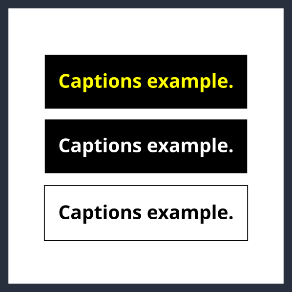
Recommendation: Caption text should be white. Some platforms might support limited customization.
Captions should be white. This ensures readability against a dark background and visibility in most viewing environments.
Authors of captions might apply colour other than white to sections of text, most commonly to differentiate speakers in situations of rapid or overlapping speech. Generally they will use a limited palette of colours which all contrast with a dark background. Because of this, a main text colour other than white might be similar to one of the highlight colours and introduce confusion.
Note: Content displayed on the web and in documents and software is subject to the requirement not to use colour alone to convey meaning, in sections 9.1.4.1, 10.1.4.1, and 11.1.4.1. Additional cues are required if colour is used to identify speakers. House style guides should address this, and may specify that colour changes not be used.
If the base colour of caption text is customized, the perception of colour changes may be obscured, since they were defined assuming a default of white. If colour changes are not used in caption text to convey meaning, however, this is not a concern. Some users prefer yellow caption text, and some platforms allow users to choose this. Less commonly, black text against a white background is also sometimes offered.
Platforms providing extended functionality may support these limited colour customisation options. Other colours introduce additional readability issues so should be avoided. Many apps need not support customization, and simply provide white captions.
Background colour
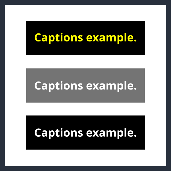
Recommendation: Captions should be displayed by default on either a 45% transparent background or a fully black background. Preferrably, allow users to choose between these options, or a fully transparent background if there are text outlines or shadows to ensure legibility.
The text of captions must be visually distinguishable from the background, which in a constantly changing video can be anything. Therefore the text lines usually have a background colour, or the captions are placed in a box with a background colour. The two most common background colours are solid black, and partially transparent black. The latter is a common default these days because it provides contrast with text colour with less impact on the video experience.
A translucent background must ensure that the white text is visible against any possible background in the video. For web, documents, and software, sections 9.1.4.3, 10.1.4.3, and 11.1.4.3 require a specific result from a calculation comparing the two colours. A 45% transparent black background meets this requirement for white or black text on any background.
A fully transparent background generally does not ensure sufficient contrast for white text – unless the text has an outline or shadow (see next section). If text outline / shadow ensures it is readable against any background, then the background can be transparent, so it impacts the underlying video less.
If providing the option for users to select black caption text, then the background must either be translucent as described above, or white. The white background should only be available for black text.
We recommend allowing users to choose among these background colours. Since any of these backgrounds should produce sufficient legibility, some platforms may only offer one.
Text outline or shadow
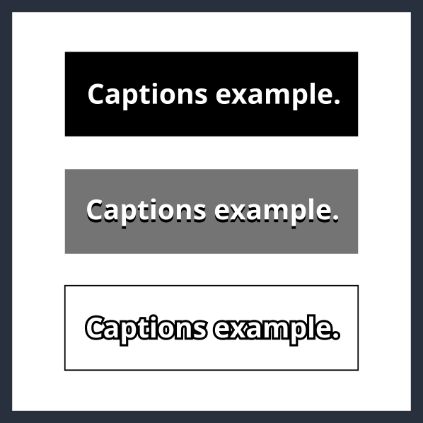
Recommendation: Include text outlines if transparent or low-contrast backgrounds are available. If they are provided, users do not need to be able to disable the outlines.
When captions have a transparent background, white text might not provide sufficient contrast at all times. In this case, it is important to ensure contrast by providing a black outline or drop shadow for the letterforms, so either the black or the white part will be visible against the background. Outlines are more common these days as they provide equal contrast for the entire letterform. To ensure it is visible, the width of the outline should be at least 2 pixels and around 10% of the font size. It is important that the outline be drawn outside the letterform, not along the font stroke and impeding into the letterform itself.
A black outline is necessary when using a transparent background, and is useful or non-harmful with other backgrounds. If the display font provides outlines, there is no need to allow users to select a non-outline font.
Next steps
This explanation of caption display customisation helps with understanding of the consideration, and provides general recommendations for how to meet the requirements. Users of captions have specific preferences and needs, which are reflected in style guides provided by Deaf advocacy organisations. Media organisations often have their own style guides, often created in consultation with Deaf users. Style guides in particular regions are thus a good reference for the preferences of users in those regions. We recommend reviewing these style guides and considering their practices along with the recommendations in this explainer.
Direct engagement with users is the best way to understand the needs and preferences of users, especially as style guides have varying levels of user representation behind them. User testing with a representative sample of Deaf users will show which customisation features are most beneficial, and identify optimal ranges.
Document author: Michael Cooper on behalf of The Digital Accessibility Centre Limited